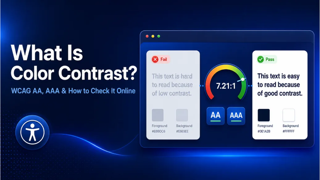
A light gray paragraph on a white page may look elegant on one monitor and become almost unreadable on another. The problem is not the font or the wording. It is color contrast.
Color contrast describes the visible difference between a foreground color and the color behind it. On a website, that usually means text against a background, but contrast also matters for buttons, form controls, icons, charts, focus indicators, and other meaningful interface elements.
This guide explains WCAG AA and AAA requirements and shows you how to test colors with the Solvioza Color Contrast Checker. You can enter colors, test text sizes, preview elements, and find accessible alternatives when the original combination fails.
What Is a Color Contrast Ratio?
A contrast ratio measures the difference in relative luminance between two colors. Relative luminance represents how bright a color appears after accounting for the human eye's different sensitivity to red, green, and blue light.
Contrast ratios range from 1:1 to 21:1:
1:1means the foreground and background have the same relative luminance.21:1is the maximum contrast, produced by black and white.- A larger number generally indicates a stronger light-dark difference.
Dark text on white normally has a high ratio. Light gray text on white may have a much lower one.
Contrast is not determined by color names or hue alone. Different-looking colors can still have similar luminance and provide weak text contrast.
Why Color Contrast Matters
Low-contrast content can be difficult to read for people with low vision, reduced contrast sensitivity, or color vision differences. Contrast sensitivity can also change with age, screen quality, brightness, glare, and surrounding light.
Good contrast also helps in glare, on dim displays, and during hurried reading. A subtle design does not need faint content.
What Does WCAG Mean?
WCAG stands for Web Content Accessibility Guidelines. The official WCAG 2.2 standard from W3C provides testable requirements for making web content more accessible.
WCAG has three conformance levels:
- Level A: Addresses foundational accessibility requirements.
- Level AA: Includes the commonly targeted minimum contrast requirements for websites.
- Level AAA: Adds stricter enhanced contrast requirements.
AA and AAA are not contrast modes or visual styles. They are broader WCAG conformance levels containing many success criteria. Passing one foreground and background pair at an AA or AAA contrast threshold does not make an entire component, page, or website WCAG conformant.
WCAG AA and AAA Contrast Requirements
WCAG AA requirements
WCAG Level AA requires a contrast ratio of at least 4.5:1 for normal text. Large text has a lower minimum requirement of 3:1 because larger, heavier characters are generally easier to recognize.
Under the official point-based definition, text is considered large when it is at least:
- 18 point, approximately 24 CSS pixels, when it is regular text, or
- 14 point, approximately 18.66 CSS pixels, when it is bold.
The pixel measurements are approximate equivalents, not the original WCAG definition. Size and weight both determine the applicable threshold.
A result below the required ratio must not be rounded up to pass. A calculated ratio of 4.49:1 does not meet a 4.5:1 requirement.
WCAG AAA requirements
Level AAA uses stronger text contrast requirements: 7:1 for normal text and 4.5:1 for large text.
AAA contrast can improve readability further, but it is not always practical for every brand color or type of content. Many websites target Level AA while using stronger contrast where it can be achieved comfortably.
The goal is readable, distinguishable content, not forcing every interface to use pure black and white.
WCAG AA and AAA compared
| Content being tested | WCAG AA | WCAG AAA |
|---|---|---|
| Normal text | 4.5:1 | 7:1 |
| Large text | 3:1 | 4.5:1 |
| Essential UI components and meaningful graphics | 3:1 against adjacent colors | No separate enhanced AAA threshold under this criterion |
Text contrast and non-text contrast are separate considerations. A button label follows the applicable text threshold, while essential visual information used to identify the button or its state may be evaluated under the non-text contrast requirement.
What Counts as Normal or Large Text?
Normal text includes most paragraphs, labels, navigation links, button labels, placeholder text, captions, and other content below the large-text threshold.
Text size alone does not make content large for contrast testing. Weight must also be considered.
| Example | WCAG classification | AA ratio needed |
|---|---|---|
| 16px regular paragraph | Normal text | 4.5:1 |
| 18px regular label | Normal text | 4.5:1 |
| 19px bold heading | Large text | 3:1 |
| 24px regular heading | Large text | 3:1 |
Very thin fonts may look weaker than their calculated ratio suggests. Treat the threshold as a minimum when a typeface has fine strokes.
Do Buttons, Icons, and Form Controls Need Contrast?
Under W3C guidance for non-text contrast, essential visual information used to identify interface components and their states generally needs a contrast ratio of at least 3:1 against adjacent colors.
This can apply to elements such as:
- Input borders needed to identify form fields
- Checkbox and radio-button indicators
- Focus outlines
- Meaningful icons
- Selected tabs or active control states
- Important chart lines or regions
Button text follows the appropriate text threshold. A small button label may therefore need 4.5:1, even when an essential component boundary is evaluated at 3:1.
Not every border, decoration, or inactive control must pass 3:1. Decorative elements may be treated differently, and the non-text requirement concerns visual information needed to identify a component or understand its state. Passing one tested pair also does not verify every part or state of the complete component.
How Is Color Contrast Calculated?
WCAG contrast is based on relative luminance rather than a simple difference between HEX or RGB numbers.
The full calculation first converts the sRGB color channels into linear values. Relative luminance is then calculated using:
Relative luminance = 0.2126R + 0.7152G + 0.0722B
(after converting sRGB channels to linear values)
The contrast ratio is then calculated with:
Contrast ratio = (L1 + 0.05) ÷ (L2 + 0.05)
L1 is the lighter color's relative luminance, and L2 is the darker color's relative luminance. The full calculation uses linearized sRGB values, not the original 0–255 channel numbers.
You do not need to calculate these values manually. An online contrast checker can evaluate the exact foreground and background colors immediately.
How to Check Color Contrast Online
Enter the foreground and background colors
Start with the real colors used by your website. Testing values that merely look similar may produce a different result.
- Open the Solvioza Color Contrast Checker.
- Enter the HEX value of the text or foreground color.
- Enter the HEX value of the background color.
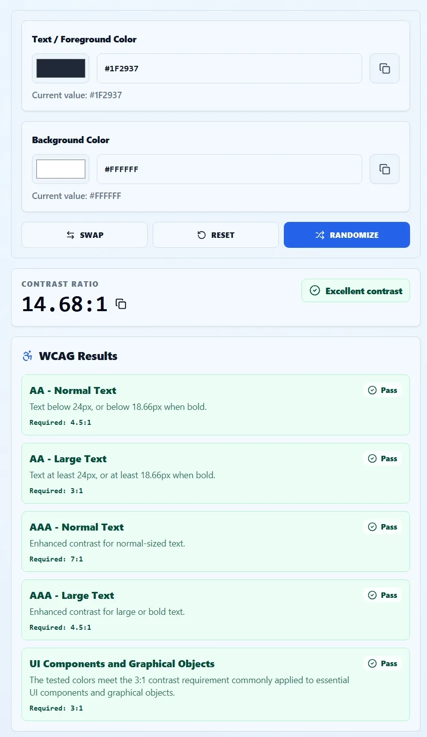
- Review the calculated contrast ratio.
- Check the pass or fail results that match the content being tested.
You can enter three-digit or six-digit HEX colors or choose them visually. Results update as the colors change, and the values and ratio can be copied directly.
Understand the WCAG results
The checker evaluates the same color pair against five useful categories:
- AA – Normal Text: Requires 4.5:1.
- AA – Large Text: Requires 3:1.
- AAA – Normal Text: Requires 7:1.
- AAA – Large Text: Requires 4.5:1.
- UI Components and Graphical Objects: Uses a 3:1 threshold for essential visual information against adjacent colors.
A combination can pass for large headings while failing for ordinary body text. That does not mean the result is inconsistent. Larger text is permitted to use a lower threshold because its characters are easier to distinguish.
Read the result that matches the content being tested. One passing row does not approve every use of the pair.
Test the actual font size and weight
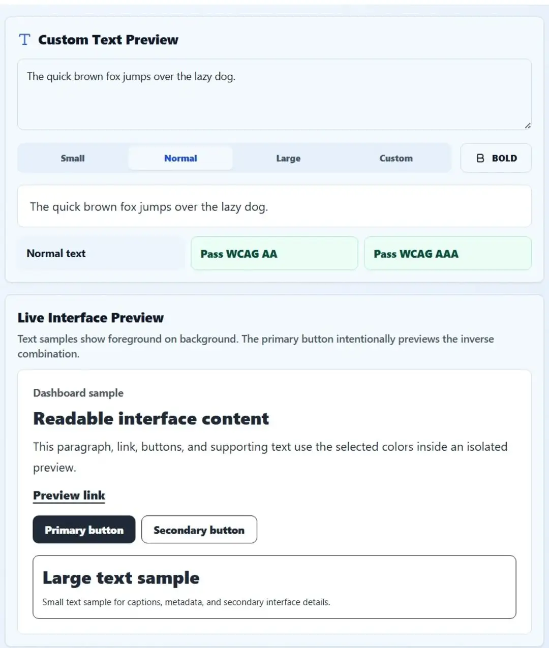
The Custom Text Preview helps you test more than a generic color swatch.
- Replace the sample sentence with text from your website.
- Select Small, Normal, Large, or Custom.
- If you choose Custom, enter the actual font size in pixels.
- Enable Bold when the real text uses a bold weight.
- Review whether that text passes WCAG AA and AAA.
The checker classifies the preview as normal or large using its size and bold setting, which helps when a heading sits near the large-text boundary.
Use the calculated result for the underlying color values, but still inspect the real typeface. A very thin font can appear less readable even when its mathematical ratio passes.
Preview the colors in an interface
A ratio tells you whether a threshold is met, but an interface preview shows how the colors behave in context.
Solvioza's Live Interface Preview applies the selected pair to headings, paragraphs, links, buttons, borders, large text, and small supporting text. The primary button intentionally displays the inverse combination, with the background color used as its text and the foreground used as its surface.
This can reveal issues missed in an isolated swatch. A pair may work for a heading but feel weak for captions, metadata, or button labels.
What to Do When a Color Combination Fails
A failed result does not always require abandoning the brand color. Often, a controlled change in lightness is enough.
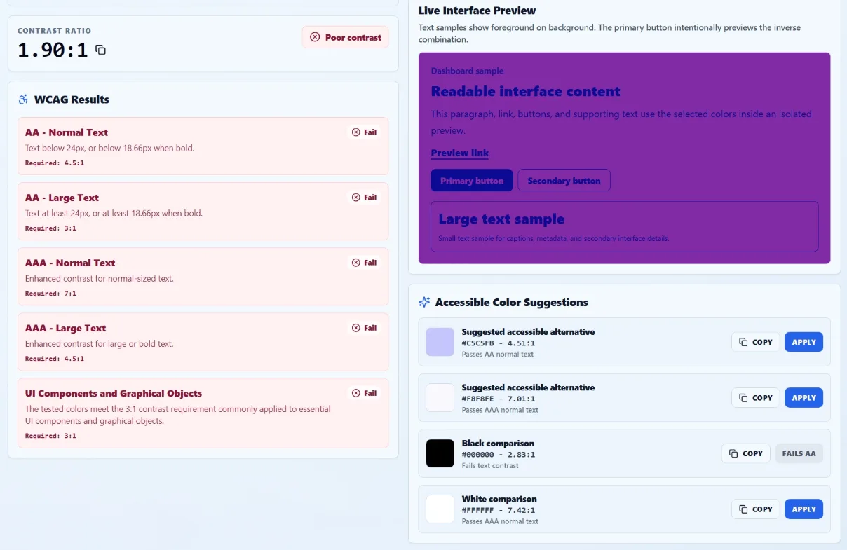
When important text fails, the tool displays accessible foreground suggestions. These can include:
- A nearby color adjusted to pass AA normal text
- A stronger alternative designed to reach AAA normal text
- Black and white comparisons for the selected background
Each suggestion shows its HEX value, contrast ratio, and passing level. You can copy a suggestion or apply an eligible color and examine it in both previews.
Preserve the color's role where possible. Darken foreground text on a light background, lighten it on a dark background, or adjust the background when the foreground is fixed.
How to Find and Test Your Website Colors
Find foreground and background colors
If you already know the CSS or design values, enter them directly into the checker.
When a color is visible elsewhere on your display, use the Screen Color Picker to capture its HEX value. Keep the target visible in a side-by-side window or on another monitor before activating the eyedropper.
If the color comes from a logo, screenshot, photograph, or uploaded design, use the Image Color Picker to sample the relevant pixel.
A text color used across white cards, tinted panels, and photographs must be tested separately against each actual background.
Check colors while building a website palette
Contrast testing works best during palette creation, not only after the website is finished.
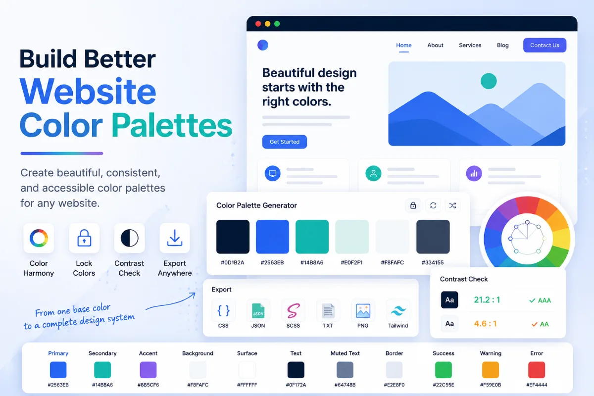
Use the Color Palette Generator to develop brand, background, text, and accent colors. Its swatches show contrast with black and white, which is useful for initial decisions. Once you know which colors will appear together, test those exact combinations in the dedicated checker.
Important combinations commonly include:
- Body text against the main page background
- Muted text against cards and panels
- Button labels against button backgrounds
- Links within paragraphs
- Form labels, hints, errors, and placeholder text
- Navigation items in default, hover, focus, and active states
- Text placed inside alerts, badges, or status messages
Attractive palette colors may still provide insufficient contrast when paired. Assigning each one a role helps identify which combinations require testing.
Contrast Over Images and Gradients Needs Extra Care
A single foreground and background test works well for solid colors. Images and gradients can contain many background values, so the contrast behind the text may change from one position to another.
Test the lightest and darkest relevant areas behind the text. If the background changes responsively, through animation, or as different images rotate into view, check every likely state.
A solid overlay, text backing, or controlled content area can create a predictable background for the text. Text shadows alone do not always provide a dependable solution.
If you create a background with the CSS Gradient Generator, check the actual text placement against multiple colors along the gradient. A passing result at one end says nothing about the middle or the opposite end.
For photographs, test the worst-case area behind the text. When it cannot be controlled, change the layout or add a stable text background.
Common Color Contrast Mistakes
Testing only body text. Navigation, buttons, form messages, placeholders, captions, and interactive states also need attention.
Assuming a brand color must remain untouched. A darker or lighter accessible variation can preserve the identity while improving readability.
Using the large-text threshold for small bold text. Bold text must still be at least 14 point, approximately 18.66 CSS pixels, to qualify as large under the WCAG definition.
Rounding a result upward. A ratio just below the requirement still fails that threshold.
Checking the wrong background. Test the color directly behind the text in normal use, including hover, focus, selected, and error states. Although inactive controls may qualify for a WCAG exception, their readability should still be considered as part of the overall user experience.
Relying on color alone. Contrast does not replace labels, icons, underlines, patterns, or other signals. For example, a form error should not be communicated only by changing a field to red.
Calling a website compliant after one successful test. Color contrast is one part of WCAG. Full conformance requires evaluating all applicable success criteria across the website.
When Do Contrast Exceptions Apply?
WCAG's text contrast criterion includes limited exceptions for logotypes, purely decorative text, invisible content, incidental text inside images with significant other visual content, and inactive interface components.
These exceptions should not become shortcuts for ordinary website content. A logo may be exempt as a logotype, but the navigation link beside it is not. A disabled control may be exempt, but an active button must remain identifiable and readable.
When a brand treatment technically falls under an exception, improving its readability is still worthwhile when a practical alternative exists.
A Reliable Contrast-Checking Workflow
- Collect the exact foreground and background colors.
- Test the pair against the threshold for its intended text or interface use.
- Enter the real font size and weight when evaluating text.
- Inspect the combination in realistic content and interface previews.
- Adjust or replace a foreground color when the original pair fails.
- Repeat the test for hover, focus, selected, error, and other meaningful states.
- Test multiple background positions when text appears over an image or gradient.
- Verify the completed page with broader accessibility testing.
Passing the ratio is the starting point. The design should remain readable across zoom levels, viewport sizes, displays, and lighting conditions.
Record approved pairings so designers and developers know which foregrounds belong on each surface.
Check Your Website Colors Before Publishing
Color contrast is one of the easiest accessibility issues to measure and one of the easiest to overlook when colors are chosen by eye.
The Solvioza Color Contrast Checker provides the ratio, AA and AAA results, text-size testing, realistic previews, and accessible alternatives in one workspace. Use it while selecting a palette, reviewing a design, or checking an existing website.
A passing result does not complete an accessibility audit or guarantee WCAG conformance. It gives you a reliable answer to one important question: can this foreground color be distinguished from the background strongly enough for its intended use?