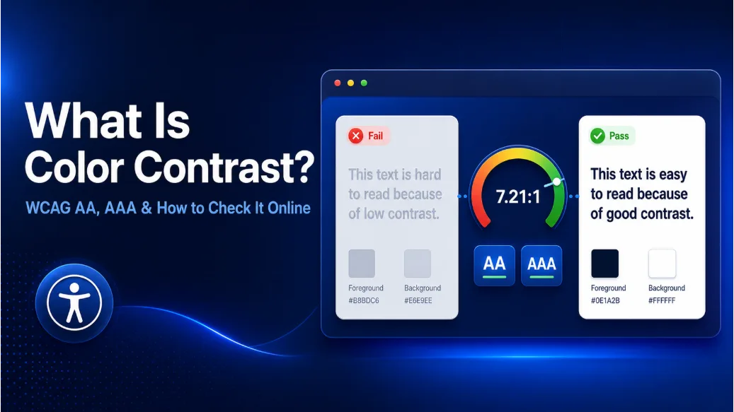
Check Color Contrast for Accessible Text and UI
Color Contrast Checker by Solvioza helps you compare a foreground color against a background color and instantly calculate the WCAG contrast ratio. Use it to test text colors, interface colors, buttons, badges, icons, form controls, status messages, and other visual elements before they reach your website, app, landing page, dashboard, or brand system.
Good contrast makes content easier to read for everyone. It is especially important for people with low vision, color vision differences, older displays, bright outdoor lighting, or tired eyes. This tool gives you a fast way to check whether a color pair meets common accessibility thresholds without opening a heavy design application or manually calculating relative luminance.
Enter HEX values manually, pick colors with the native color picker, swap foreground and background colors, randomize combinations, copy the ratio, and preview the colors in realistic UI examples. The result updates live, so designers, developers, content editors, and product teams can make quick color decisions with confidence.
What This Contrast Checker Measures
The tool measures the contrast ratio between two tested colors. The foreground color is treated as the text or object color, and the background color is treated as the surface behind it. The ratio is shown in the familiar format such as 4.5:1, 7:1, or 21:1.
Contrast ratios are based on relative luminance, which is how WCAG compares the perceived brightness of two colors. A ratio of 1:1 means there is no contrast, such as white on white. A ratio of 21:1 is the maximum contrast, such as black on white.
WCAG AA and AAA Results
The checker shows results for common WCAG contrast targets:
- AA normal text: at least 4.5:1
- AA large text: at least 3:1
- AAA normal text: at least 7:1
- AAA large text: at least 4.5:1
- UI components and graphical objects: commonly tested at 3:1 for essential visual information
Large text is text at least 24px, or at least 18.66px when bold. Smaller text usually needs stronger contrast because thin strokes and small shapes are harder to read.
Preview Text at Real Sizes
The custom preview helps you test the selected color pair with your own text. You can switch between small, normal, large, and custom font sizes, then toggle bold text to see how the color pair performs under WCAG size rules.
This is useful when checking button labels, navigation links, captions, helper text, cards, dashboard labels, or marketing copy. A color combination that passes for a large heading may still fail for small body text, so previewing the exact text style can prevent accessibility issues before implementation.
Live Interface Preview
The live preview shows how the tested colors behave in a compact interface sample, including text, links, buttons, inputs, badges, dividers, list rows, status messages, disabled states, and icon-only actions. This makes it easier to judge readability beyond a single paragraph.
Normal text in the preview uses the selected foreground color on the selected background color. The primary button also demonstrates the inverse combination, where the foreground becomes the button background and the selected background becomes the button text. The contrast ratio is mathematically the same in both directions, but the preview makes the relationship easier to understand visually.
Accessible Color Suggestions
When a color pair fails important text contrast checks, the tool can suggest accessible foreground alternatives against the current background. Suggested alternatives are designed to preserve the feel of the original color where possible while reaching useful WCAG thresholds.
Apply buttons are reserved for suggestions that pass AA normal text contrast. Black and white comparisons may also appear so you can quickly see the strongest simple alternatives, but a failing comparison is shown as a reference rather than an accessible fix.
Common Uses
- Check website text colors before publishing a page.
- Verify button, badge, link, and form-control color pairs.
- Test brand colors for accessible digital use.
- Compare dark mode and light mode color combinations.
- Find accessible foreground alternatives for a fixed background.
- Copy HEX values and contrast ratios for design documentation.
Private Browser-Based Workflow
The Color Contrast Checker runs directly in your browser. Your color choices and preview text are not uploaded for contrast calculation, which makes it convenient for everyday UI work, client projects, internal dashboards, and early design exploration.
Use it whenever you need a quick, readable answer to a simple but important question: can people actually see this color combination clearly?