Choosing colors for a website can start as a simple decision and quickly become complicated. You find a blue you like, add another color for buttons, choose a background, and suddenly nothing feels as though it belongs together.
A useful website color palette is more than a collection of attractive colors. Each color needs a purpose, and the complete set should remain readable, consistent, and flexible across different pages.
This guide explains how to create a color palette for your website with the Solvioza Color Palette Generator. We will begin with the basic decisions and gradually move into contrast, color roles, reusable design tokens, and developer-friendly exports.
What Is a Website Color Palette?
A website color palette is the collection of colors used throughout a site. It normally includes a primary brand color, supporting colors, background shades, text colors, borders, and colors for important states such as success or errors.
The goal is consistency. A visitor should not encounter a different shade of blue every time they move to another page or see buttons changing color without a clear reason.
A small, organized palette makes design decisions easier. It also helps developers reuse the same values instead of selecting new colors whenever they build a component.
Start With Color Roles, Not a Large List of Colors
Before generating anything, decide what the colors need to do.
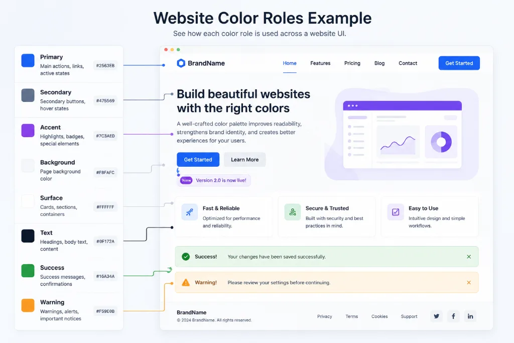
A beginner-friendly website palette can be organized into these roles:
- Primary color: Used for important buttons, links, active controls, and recognizable brand elements.
- Secondary color: Supports the primary color and adds variety without competing with it.
- Accent color: Draws attention to selected details, labels, highlights, or special actions.
- Background colors: Create the main page surface and separate sections.
- Text colors: Provide readable headings, body text, and quieter secondary text.
- Feedback colors: Communicate success, warning, error, and informational states.
These roles do not always require completely different hues. One base color can provide several lighter and darker variations.
How Many Colors Does a Website Need?
Most websites do not need ten competing brand colors. A focused palette of five or six colors is usually a better place to begin.
That might include one primary color, one secondary or accent color, a light background, a dark text color, and one or two supporting shades.
The interface may eventually use more values for borders, hover states, alerts, and dark mode. Those should grow from the main palette instead of feeling unrelated.
Start small. Expansion is easy once the visual direction is clear.
Choose a Base Color for Your Website
The base color is the starting point from which the rest of the palette is generated. It may come from your logo, an existing brand guide, a product image, or a color you already use in marketing materials.
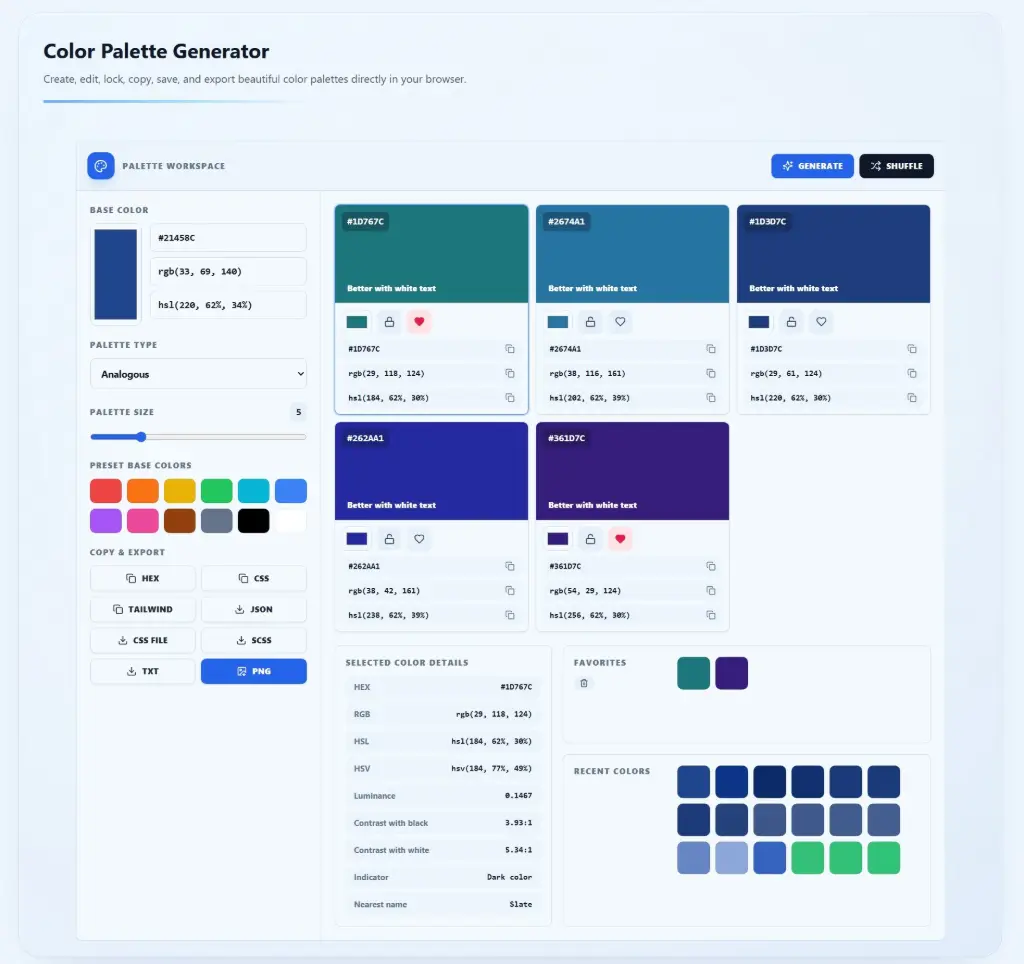
Open the online Color Palette Generator and choose a base color using the visual color input. If you already know the exact value, enter it as HEX, RGB, or HSL.
You can also select one of the preset base colors when you are still exploring ideas.
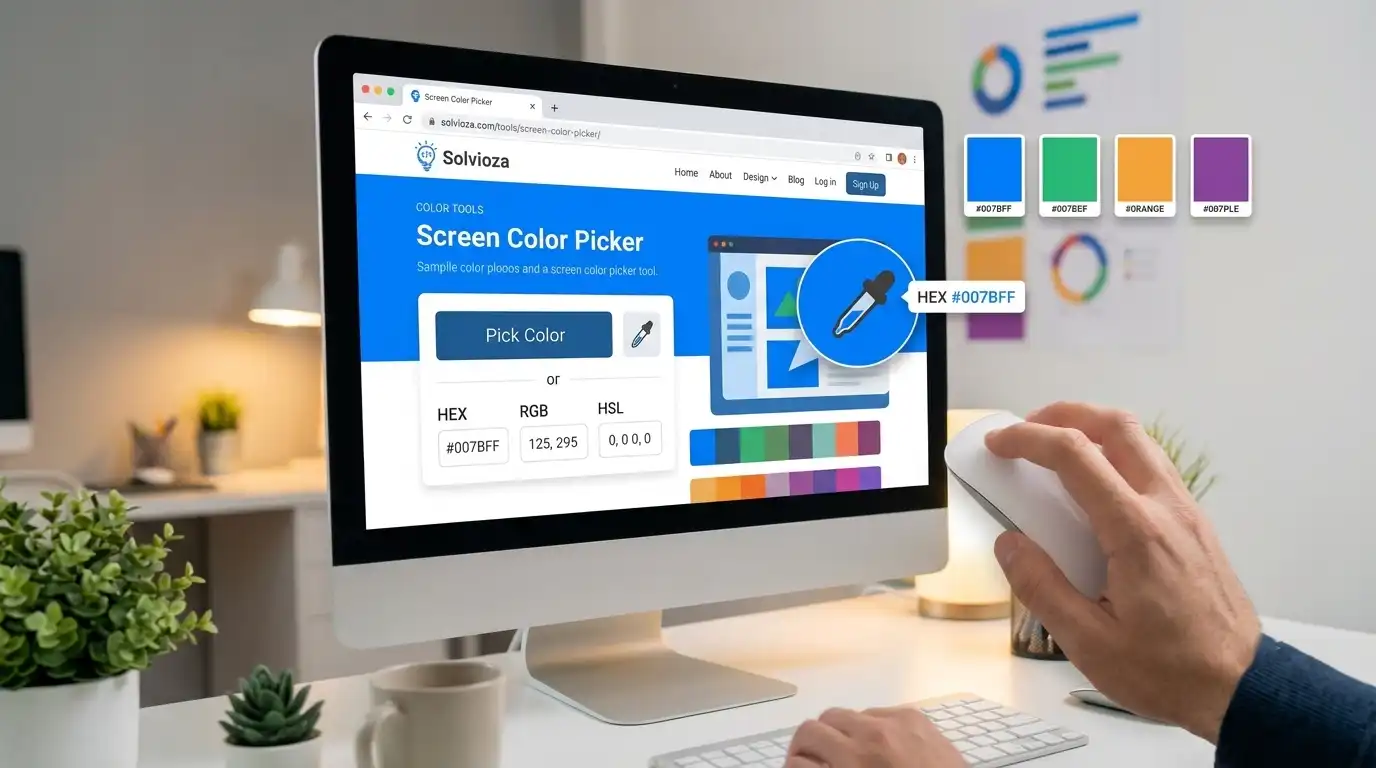
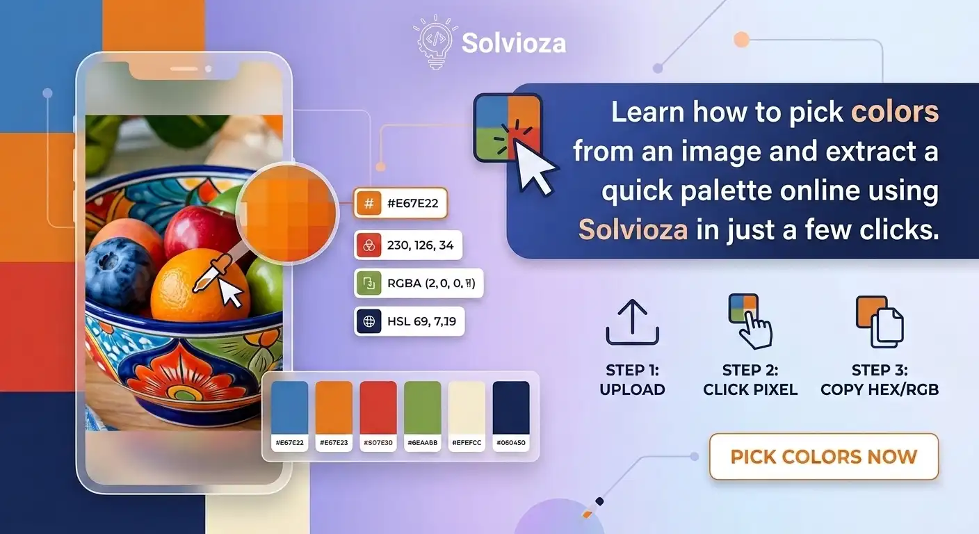
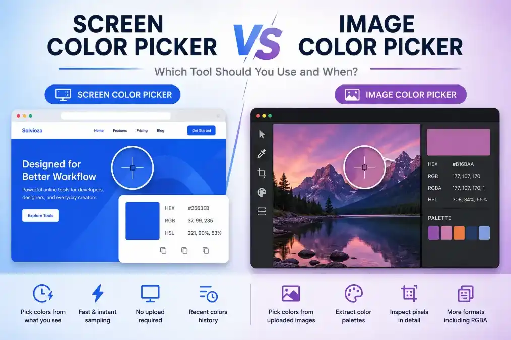
If your starting color appears in a logo or photograph, use the Image Color Picker to sample it directly from the image. When the color is visible elsewhere on your screen, the Screen Color Picker can capture it without requiring an uploaded file.
Choose the Right Color Harmony
Color harmony describes how colors relate to one another. You do not need to memorize color theory, but understanding a few palette types makes the generator much easier to use.
| Palette type | How it works | Good for |
|---|---|---|
| Monochromatic | Uses variations of one hue | Clean dashboards, professional sites, and simple brands |
| Analogous | Combines neighboring colors | Calm and visually connected designs |
| Complementary | Pairs colors from opposite sides of the color wheel | Strong contrast and noticeable calls to action |
| Split complementary | Uses a base color with two colors near its opposite | Contrast with more flexibility than a direct complementary pair |
| Triadic | Uses three evenly spaced hues | Playful brands and colorful interfaces |
| Tetradic or square | Builds a broader four-hue combination | Detailed designs with carefully assigned color roles |
| Shades, tints, or tones | Mixes the base color with black, white, or gray | Backgrounds, borders, hover states, and visual hierarchy |
For a first website palette, analogous, complementary, or monochromatic combinations are usually manageable. Tetradic and square palettes provide more variety, but every color needs a clearly defined job.
Generate a Website Color Palette With Solvioza
Once you have a base color, the rest of the process takes only a few steps.
- Open the Solvioza Color Palette Generator.
- Select a base color or enter its HEX, RGB, or HSL value.
- Choose a palette type, such as analogous, complementary, triadic, or monochromatic.
- Set the palette size from 3 to 12 colors.
- Review the generated colors and select individual swatches to inspect their values.
- Lock any colors you want to keep.
- Generate or shuffle again to explore alternatives without replacing the locked colors.
Locking colors is particularly helpful when most of a palette works but one or two swatches still feel wrong. Keep the strong choices in place and continue experimenting with the rest.
Turn Generated Colors Into a Working Website System
A generated palette is a starting point, not a finished design system. The next step is assigning each color a job.
Suppose your palette contains a dark navy, medium blue, pale blue, green, and an off-white shade. You could use them like this:
- Dark navy for headings and important text
- Medium blue for primary buttons and links
- Pale blue for selected states and highlighted sections
- Green for success messages or a limited accent
- Off-white for the main page background
That is more useful than describing the same colors as “navy, blue, light blue, green, and white.” Roles tell designers and developers where each value belongs.
Use the 60-30-10 Rule as a Starting Point
The 60-30-10 rule is a simple way to control how much visual space each part of a palette receives.
- 60% dominant color: Usually a neutral page background or large surface color.
- 30% supporting color: Used for sections, cards, navigation, or secondary elements.
- 10% accent color: Reserved for buttons, links, highlights, and important actions.
The percentages do not need to be exact. The useful idea is restraint: the brightest color should not occupy every part of the page.
An accent works because it is uncommon. When everything is emphasized, nothing stands out.
Check Text Contrast Before Approving the Palette
A color combination can look polished and still be difficult to read. This often happens when light text is placed on a bright background or when gray body text is too close to the page color.
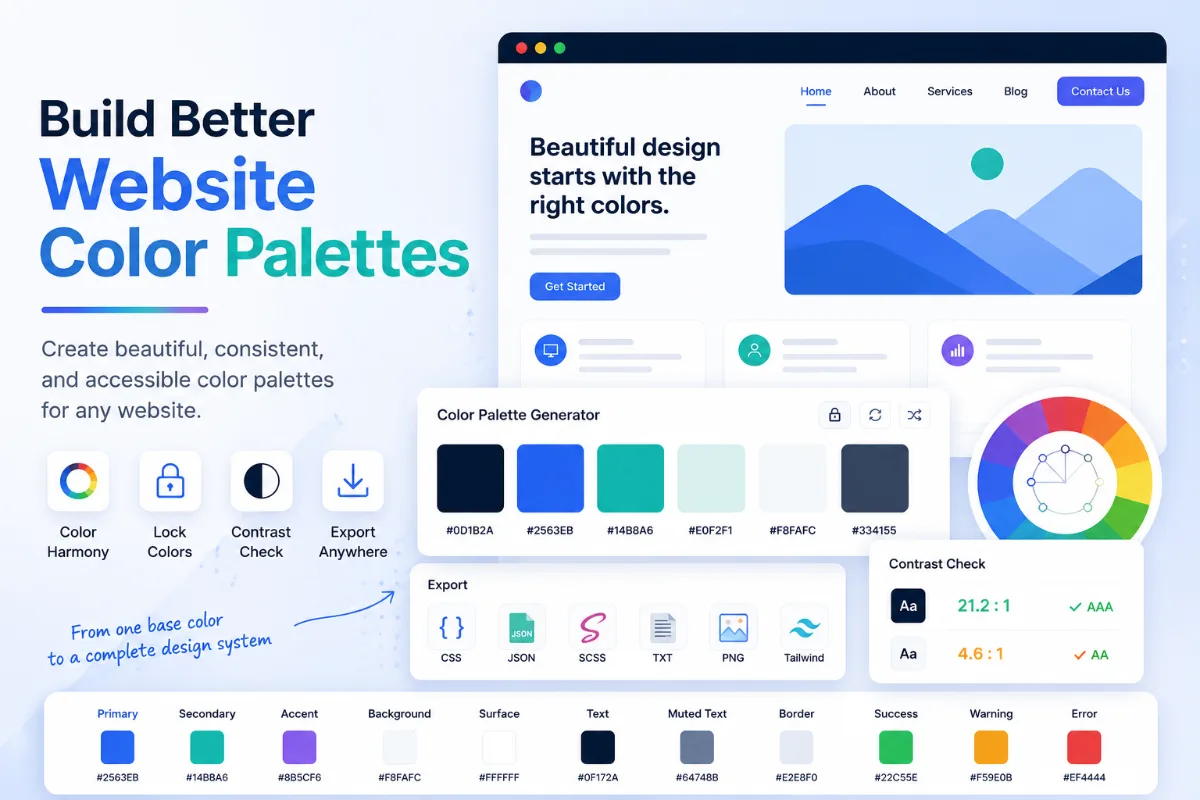
In the Solvioza palette workspace, select a swatch to see its contrast ratio with black and white. The tool also indicates which text color provides the better contrast for that swatch.
As a practical target, normal body text should generally have a contrast ratio of at least 4.5:1. Large text can often use a minimum of 3:1. These are useful accessibility targets based on WCAG guidance.
Do not test only the brand color. Check the combinations people will actually read: body text on the page background, button labels on buttons, navigation links, form labels, and status messages.
Create Lighter and Darker Variations
A website rarely works with only one version of its primary color. Buttons need hover states, highlighted areas need softer backgrounds, and dark text or borders may require deeper shades.
Use the Shades mode to create darker versions of a base color. Tints move the color toward white, while Tones introduce gray for more muted alternatives.
Monochromatic mode is also useful when you need a complete family built around one recognizable hue.
These variations can support:
- Default, hover, and pressed button states
- Soft notification backgrounds
- Borders and separators
- Selected navigation items
- Light and dark website themes
Avoid the Most Common Website Palette Mistakes
Using too many saturated colors. Bright colors compete for attention. Keep most surfaces neutral and reserve stronger colors for meaningful actions.
Choosing colors without assigning roles. A collection of swatches is difficult to apply consistently until every important color has a purpose.
Ignoring contrast. A brand color should not be forced into body text or button backgrounds when it makes the content difficult to read.
Relying on color alone. Error messages, selected controls, and form feedback should also use text, icons, borders, or other visible signals.
Testing colors separately. A shade may look excellent by itself but feel completely different beside another color. Review the full palette together and test it in a real page layout.
Save, Copy, and Export Your Final Palette
When you find useful colors, save them as favorites inside the generator. Recent selections are also kept available, making it easier to return to an earlier direction while experimenting.
Individual colors can be copied as HEX, RGB, HSL, or HSV values. For the complete palette, Solvioza can copy all HEX values, CSS variables, or a Tailwind-ready color object.
You can also download the palette as JSON, CSS, SCSS, TXT, or PNG. Choose the format based on how you plan to use it:
- CSS or SCSS: Useful for direct website development.
- Tailwind object: Convenient for adding colors to a Tailwind configuration.
- JSON: Suitable for structured storage or sharing between applications.
- TXT: A simple reference containing the color values.
- PNG: Helpful for visual mood boards, presentations, and client approval.
Pro Step: Convert Colors Into Design Tokens
Developers can make a palette easier to maintain by naming colors according to their purpose rather than their appearance.
Instead of names such as blue-1 and blue-2, use names that explain where the colors belong:
:root {
  --color-background: #F8FAFC;
  --color-surface: #FFFFFF;
  --color-text: #0F172A;
  --color-text-muted: #475569;
  --color-primary: #2563EB;
  --color-primary-hover: #1D4ED8;
  --color-accent: #0F766E;
}
This makes future changes much easier. If the brand’s primary color changes, the developer can update the token instead of searching for the old HEX value throughout the website.
Test the Palette on Real Interface Elements
Do not approve a website color scheme from swatches alone. Apply it to a small sample containing a page background, heading, body paragraph, link, button, card, form field, and alert message.
This reveals problems that a palette preview cannot show. The accent may be too strong for large areas, muted text may be difficult to read, or two colors may look almost identical when used as interface states.
Also test the design on more than one screen. Displays, brightness settings, and viewing conditions can change how colors appear.
Build Your Website Palette in Solvioza
You do not need advanced color theory to create a usable website palette. Begin with one dependable base color, generate a suitable harmony, assign clear roles, and test contrast before adding the colors to your site.
The Solvioza Color Palette Generator brings those steps into one workspace. You can create palettes with 3 to 12 colors, lock strong choices, compare text contrast, save favorites, and export the finished result for design or development.
A good palette should make future decisions simpler. When each color has a purpose, the website feels consistent without requiring every page to look exactly the same.