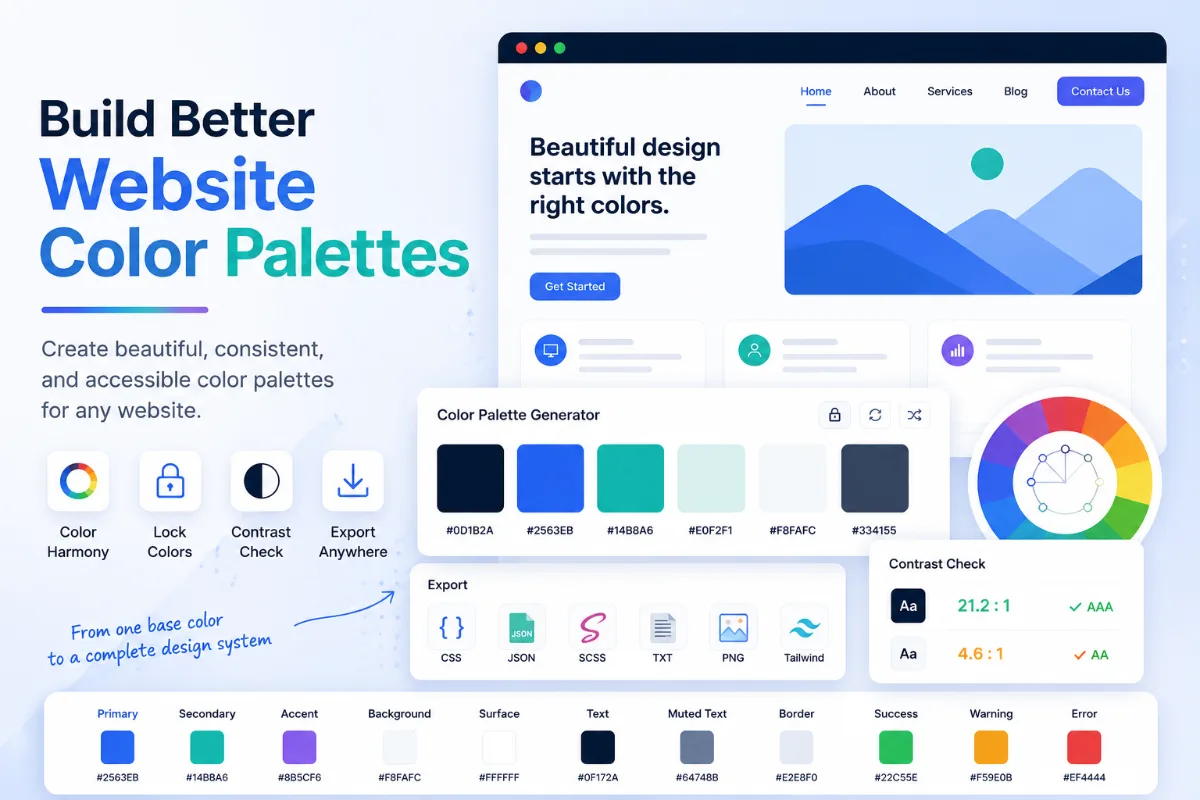
Sometimes the right color is already sitting inside an image.
It might be a product photo, a brand graphic, a website screenshot, a poster, a social media post, or a piece of artwork. You like the color, but you do not know the exact code.
That is where an image color picker helps.
With Solvioza, you can upload an image, click any pixel to pick its exact color, copy the value in HEX, RGB, RGBA, or HSL, and even extract a simple palette from the same image. It is a quick way to move from “I like that color” to “Here is the exact value.”
If the image needs cleanup first, you can crop it with the Image Cropper or reduce oversized dimensions with the Image Resizer before picking colors.
What Does an Image Color Picker Do?
An image color picker lets you sample the exact color of a pixel inside an image.
Instead of guessing or trying to match the shade by eye, you can click directly on the image and get the precise value.
That is useful when you want to:
- match a brand color from a logo
- reuse a background color from a design
- grab a button color from a screenshot
- identify a product shade from a photo
- build a palette from artwork or photography
- copy exact color codes for a website or design tool
Solvioza’s Image Color Picker gives you the selected color in multiple formats, so you can use the one that fits your workflow.
Why Pick Colors From an Image Instead of Guessing?
Guessing is fine until the color needs to match.
A small difference in tone can make a website button feel off, a logo look inconsistent, or a product mockup lose its visual balance.
That is why exact values matter.
When you pick a color directly from an image, you remove the guesswork. You get the actual color instead of a close imitation.
This becomes especially helpful if you are working on:
- website design
- social media graphics
- branding work
- digital products
- product photography
- blog graphics
- color palette planning
It is faster, and it is more reliable.
How to Pick a Color From an Image Online
The basic workflow is simple.
- Open Solvioza’s Image Color Picker.
- Upload your image.
- Click anywhere on the image.
- Read the selected color values.
- Copy the format you need.
That is enough for one exact color.
If you need more than one, you can keep clicking around the image and build a small set of useful colors from different areas.
Upload the Image First
Start by uploading the image you want to sample.
The Solvioza tool supports common formats like JPG, PNG, and WebP, so most normal images will work immediately.
If the image is very large, very cluttered, or contains too much empty space, it can help to prepare it first. You can use the Image Cropper to isolate the area you care about or use the Image Resizer if the file is unnecessarily large for a simple color-picking task.
That step is optional, but it can make the process cleaner.
A tighter image is often easier to work with.
Click Any Pixel to Pick Its Exact Color
Once the image is loaded, click any point on it.
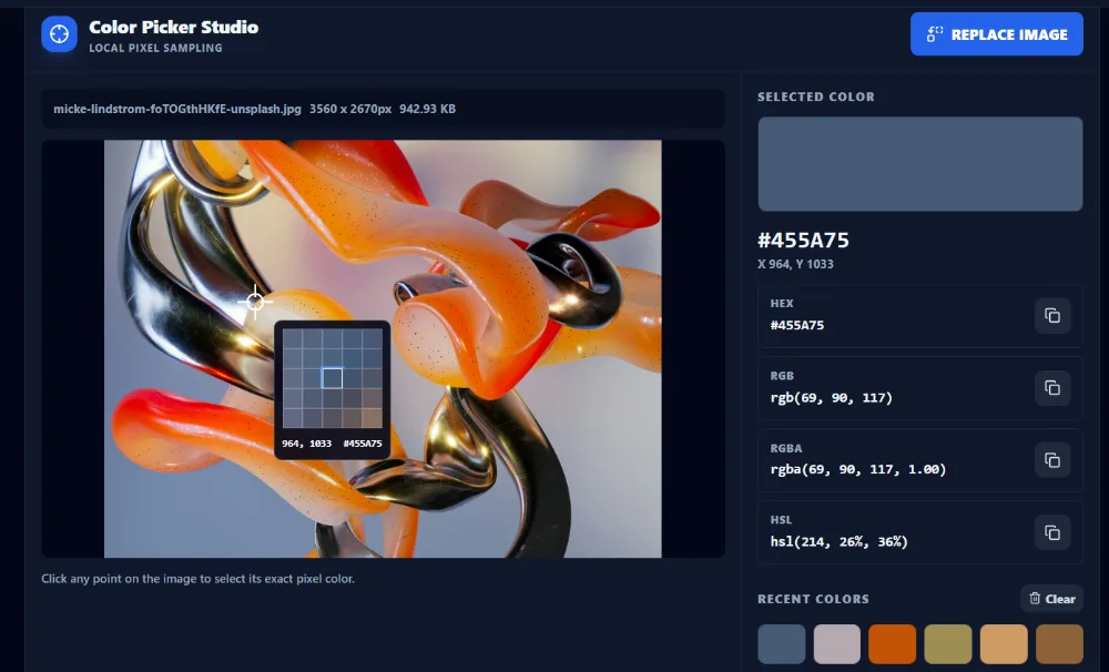
Solvioza reads the exact pixel color at that position and shows you the result immediately.
This is useful because the color you want is not always a big flat area. Sometimes it is a subtle highlight, a fabric tone, a shadow, or a tiny brand accent inside a logo.
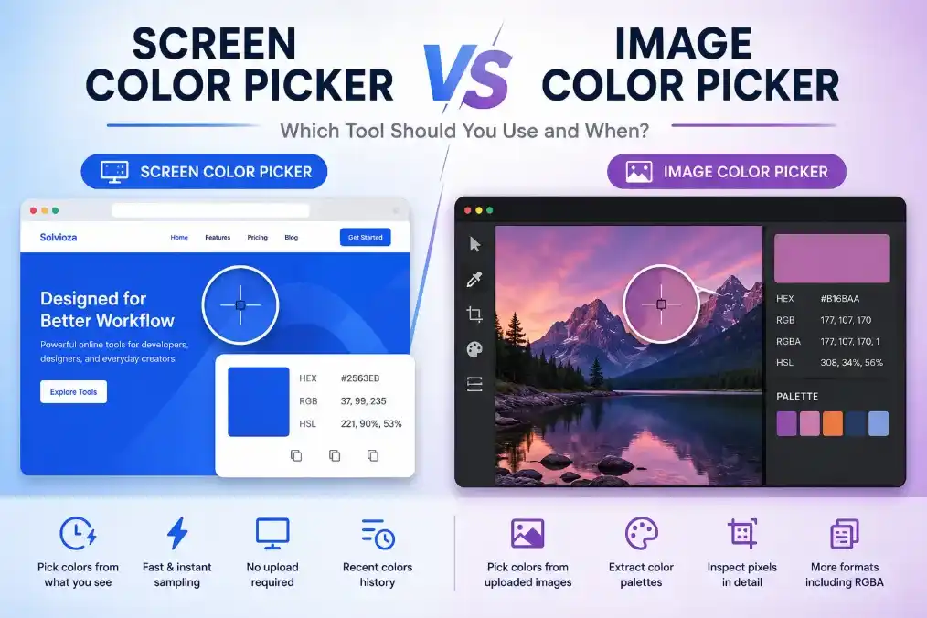
The tool also shows a small pixel preview around the selected area, which helps when you want to be more precise.
That makes it easier to avoid clicking the wrong nearby shade.
Copy HEX, RGB, RGBA, or HSL
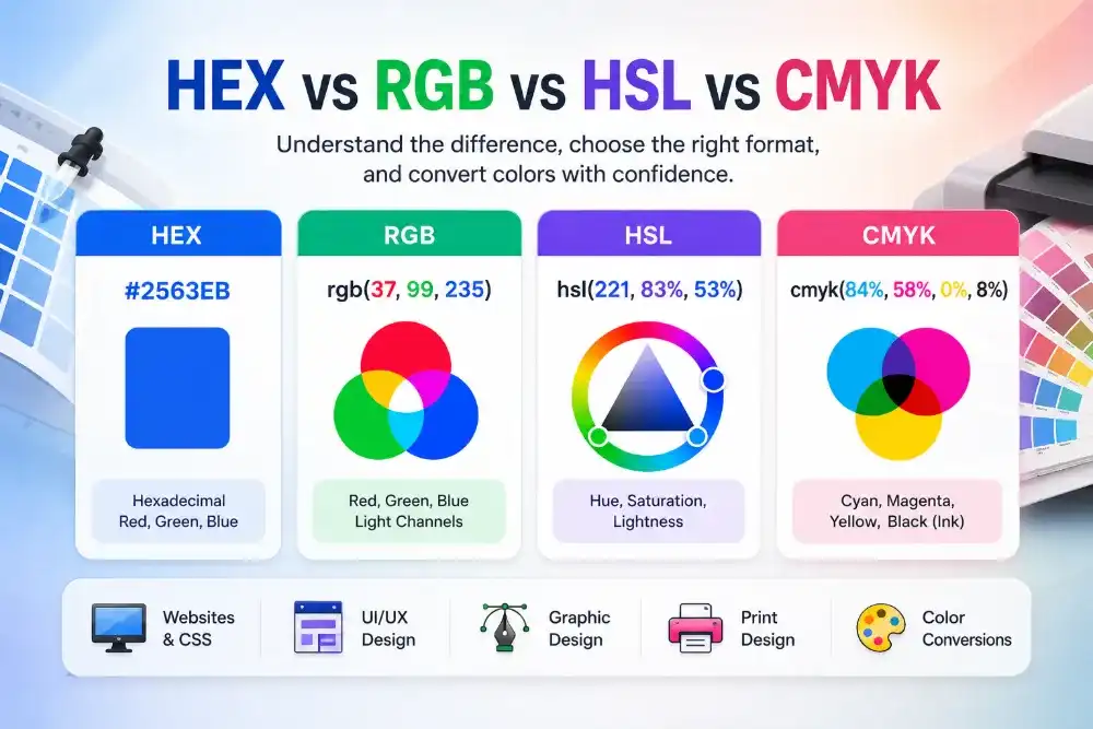
After you pick a color, Solvioza shows the result in multiple formats:
- HEX
- RGB
- RGBA
- HSL
That matters because different workflows use different color systems.
Use HEX when:
- you are working in CSS
- you need a simple web color code
- you want a short shareable value
Use RGB when:
- you need red, green, and blue channel values
- you are working with design tools or developer workflows
Use RGBA when:
- you need transparency support in styling or overlays
Use HSL when:
- you want a more intuitive sense of hue, saturation, and lightness
- you plan to adjust the color later in CSS or design systems
The tool lets you copy any format directly, so you do not need a second converter.
Use Recent Colors to Compare Shades
One useful part of the Solvioza tool is the recent color history.
Every time you pick a new color, it keeps a short list of recently selected swatches. That helps when you are comparing similar tones or deciding which version feels best.
This is especially useful in images with:
- soft gradients
- multiple fabric tones
- shadow and highlight variations
- skin tones
- product color variations
- outdoor scenes with changing light
Instead of relying on memory, you can compare real picks side by side.
That makes the tool practical not just for one click, but for actual design decisions.
How to Extract a Color Palette From an Image
Sometimes one color is not enough.
You may want a small set of dominant colors from the image so you can build a palette for a website, a social post, a product card, or a presentation.
That is where palette extraction helps.
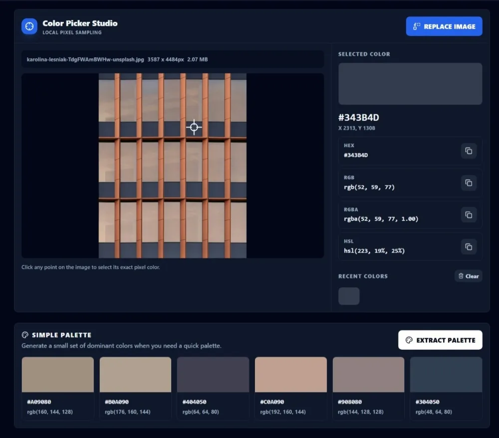
In Solvioza, you can upload the image and use the extract palette option to generate a quick set of dominant colors. The tool gives you a small palette you can copy from directly.
This is useful when you want to:
- build a brand-inspired color set
- pull a palette from a photo
- find matching accent colors
- create a moodboard palette
- reuse tones from packaging or product photography
- build a cleaner design system around an existing visual
It is quick, and it gives you a practical starting point instead of a random collection of colors.
When a Palette Is More Useful Than One Picked Color
A single color works when you need one exact match.
A palette works better when you are designing something larger.
For example, if you are building a landing page from a hero image, one color is not enough. You may need:
- a primary color
- a secondary color
- a dark anchor color
- a soft neutral
- a highlight color
- a background tone
The extracted palette gives you that broader view.
From there, you can decide which colors should lead and which should stay in supporting roles.
That makes the article useful not only for “pick a color from image” searches, but also for “extract color palette from image” intent.
How to Get Better Color Picks
The easiest way to get better results is to be selective.
Do not just click randomly across the image. Decide what you are trying to pull from it.
For example:
- If you want the main brand tone, click the logo or primary object.
- If you want background colors, sample the large surrounding areas.
- If you want accent colors, pick small but intentional highlights.
- If you want clean swatches, avoid noisy textured areas when possible.
If the image is busy, crop it first with the Image Cropper so you can focus only on the useful section.
If you are working with a giant file from a phone or camera, resizing it first with the Image Resizer can make the workflow feel lighter without changing the practical result for color sampling.
Use Cases for Picking Colors From Images
This tool is helpful in more situations than people expect.
A few common examples:
- extracting brand colors from a logo
- copying product colors from store photography
- matching website colors from a screenshot
- building social media templates from an image
- creating blog graphics around a featured image
- pulling a palette from artwork or photography
- choosing background and text colors that already feel connected
If you are designing around an existing image, starting with its real colors usually creates a more consistent result than inventing a palette from scratch.
What If the Image Is Too Large or Heavy?
Color picking does not usually require a huge source file.
If the image is oversized, the tool can still work, but the file may feel heavier than necessary. In that case, the Image Resizer can help reduce dimensions before you upload it. If the file itself is too large, the Image Compressor can help trim the weight without changing the practical goal of sampling colors.
This matters most when you are using exported photos, screenshots, or high-resolution product images.
A smaller working file is often easier to handle.
Common Mistakes to Avoid
One common mistake is picking colors from shadows when you actually wanted the true surface color.
Another is pulling colors from compressed or low-quality images and assuming the result is the original brand tone.
Other mistakes include:
- sampling the wrong nearby pixel
- using only one color when the design needs a full palette
- ignoring contrast between extracted colors
- copying a color without checking where it came from
- building a palette from a very noisy image
- forgetting to crop distracting areas first
The tool is precise, but the choices still matter.
Pick intentionally.
FAQ
How do I pick a color from an image online?
Upload the image to Solvioza’s Image Color Picker, click any point on the image, and copy the color value in HEX, RGB, RGBA, or HSL.
How do I extract a color palette from an image online?
Upload the image, then use the palette extraction option to generate a quick set of dominant colors you can copy and reuse.
Can I copy HEX color codes from an image?
Yes. Solvioza shows the picked color in HEX format and lets you copy it directly.
What color formats can I get from the image?
You can get HEX, RGB, RGBA, and HSL values from the selected pixel.
Why does the picked color look slightly different from what I expected?
You may have clicked a nearby shadow, highlight, or compressed area. Try zooming your attention to a cleaner part of the image and sample again.
Should I crop the image before extracting colors?
If the image is busy or contains distracting areas, yes. Cropping first with the Image Cropper can make the results more focused.
Final Thoughts
If you want to pick colors from an image or extract a simple palette, Solvioza already gives you the useful parts without extra noise.
You can upload an image, click for an exact color, copy the format you need, compare recent swatches, and generate a quick palette from the same file. That covers both precise sampling and broader palette planning in one place.
For most people, that is enough to move from inspiration to usable color values in a minute or two.