Sometimes a color stops you in the middle of your work.
It might be the blue of a button on a landing page, the muted gray of a dashboard panel, the soft green inside a product banner, or the exact accent color used in a logo preview. You can see it clearly, but that does not mean you can use it. Until you know the actual color code, it is still just a visual reference.
That is why a screen color picker is so useful.
Instead of guessing, taking screenshots, zooming in, and trying to approximate the shade in another tool, you can simply pick the color directly from your screen and copy the result. Solvioza’s Screen Color Picker is built for exactly that kind of quick, precise work.
If the color is already visible on your monitor, you should not have to work hard to capture it.
What a screen color picker actually does
A screen color picker lets you sample a color from something you are already looking at.
That could be:
- a website
- a browser window
- a web app
- a presentation slide
- a dashboard
- a design preview
- a screenshot opened on your screen
- a brand asset shown inside another tool
The point is simple: you do not need to upload an image first.
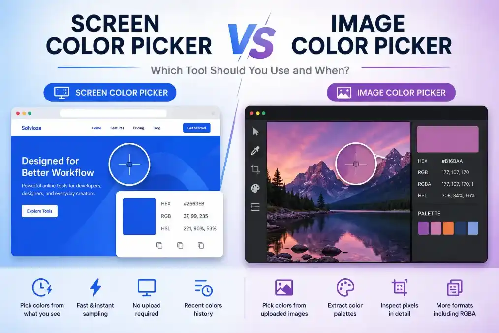
That is the biggest difference between a screen color picker and a regular image color picker. One samples from the live screen. The other samples from a file.
If you already have a JPG, PNG, or WebP and want to click inside that file, Solvioza’s Image Color Picker is the better fit. But if you are actively browsing, designing, comparing, or inspecting colors on screen, the Screen Color Picker is the faster route.
Why this matters more than it sounds
Color work often looks small from the outside.
You might think you just need something close to a color, especially if you are moving fast. But tiny differences are where interfaces start to drift. A brand accent becomes slightly wrong. A button no longer matches the original design. A rebuild looks clean, but not faithful.
That usually happens because the color was estimated instead of captured.
When you sample the exact value from the screen, that uncertainty disappears. You are not working from memory. You are not matching by eye. You are using the real thing.
For developers, that means fewer little visual mismatches.
For designers, that means cleaner consistency.
For marketers and content teams, that means branded graphics stay closer to the source material.
It is one of those tools that removes friction from many small moments instead of solving one giant problem.
How Solvioza Screen Color Picker works
Solvioza’s Screen Color Picker uses the browser EyeDropper feature.
When the browser supports it, the tool opens a system-level eyedropper mode. You click the eyedropper button, move over the visible color you want and click to select it. This works well with side-by-side windows, content shown on another monitor, or anything already visible while the picker is active.
Once you do that, Solvioza returns the chosen color and shows it in formats you can actually use.
The tool currently gives you:
- HEX
- RGB
- HSL
It also keeps a short list of recent colors, which becomes helpful surprisingly fast once you start comparing shades from the same interface.
That means the tool is not only good for grabbing one color and leaving. It is also useful when you want to build a small reference set while inspecting a page or app.
The browser support note you should know first
This tool depends on browser support.
That matters because screen-based color picking is not purely a visual widget built inside the page. It relies on a browser feature that has to exist before Solvioza can use it.
If your browser supports the EyeDropper API, the tool works directly.
If it does not, Solvioza tells you clearly instead of pretending something is broken for mysterious reasons.
In practice, this usually works best in desktop Chromium-based browsers such as Chrome and Edge. If you open the tool in another browser and support is missing, the simplest fix is usually to try it in one of those.
Tip: If the color is in another browser tab, switching tabs will usually cancel the eyedropper. For the smoothest workflow, keep the target visible using split-screen, another browser window, or a second monitor before starting the picker.
That is worth mentioning in the article because it sets the right expectation before someone thinks the tool is failing.
The workflow is short, but the result is precise
Using the tool is almost suspiciously simple.
- Open Solvioza Screen Color Picker.
- Click the eyedropper button.
- Move over the visible color you want and click once.
- Copy the value you need.
That is really it.
There is no upload stage because this is not an uploaded-image workflow.
There is no manual matching stage because you are sampling the actual color.
There is no separate converter stage because Solvioza already shows the result in useful formats.
It is a short process, but it solves a very specific and very common problem.
What kinds of things people usually sample
Not every on-screen color is equally useful.
Some are one-off decoration choices. Others become core reference colors that shape the rest of your work.
The most common screen-picked colors tend to come from:
- primary call-to-action buttons
- section backgrounds
- brand accents
- tag and badge colors
- card borders
- chart highlights
- hero overlays
- text colors in polished UI systems
This is especially true when someone is rebuilding or extending an existing interface. Instead of asking what blue is that, they can just pick it directly and keep moving.
Picking one color is easy. Picking the right pixel takes a little care.
This is where the tool stays exact, but the user still needs judgment.
If you click a solid area, like a flat button background, the result is usually straightforward.
If you click the edge of text, a shadow, a gradient, or a textured image, the returned color may be technically correct but not the one you meant. Anti-aliasing, subtle lighting, and overlays can all shift a pixel value.
So if the color feels slightly wrong, do not assume the tool failed. More often, you sampled a nearby variation instead of the main surface color.
A few habits help:
- sample from larger flat areas when possible
- avoid the blurred edge of text
- avoid hover glow and drop shadows if you want the base color
- sample more than once if the area is gradient-based
- compare a few nearby picks before deciding
This is especially important on modern interfaces, where a single color is sometimes actually several related shades layered together.
HEX, RGB, and HSL are not just duplicates
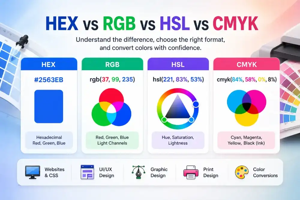
Solvioza gives you three formats because they are useful in different ways.
HEX is often the quickest choice for web work. If you are pasting into CSS, a theme config, a design handoff note, or a quick chat message, HEX is compact and familiar.
RGB is useful when you want the numeric channel values directly. Some design systems, canvas workflows, and UI libraries still lean on RGB formatting for certain tasks.
HSL becomes useful when you want to reason about the color rather than just paste it. If you plan to make the color lighter, darker, softer, or more saturated later, HSL gives you a cleaner way to think about those adjustments.
So the value of the tool is not only that it picks the color. It also returns it in formats that fit different kinds of work without asking you to convert it elsewhere.
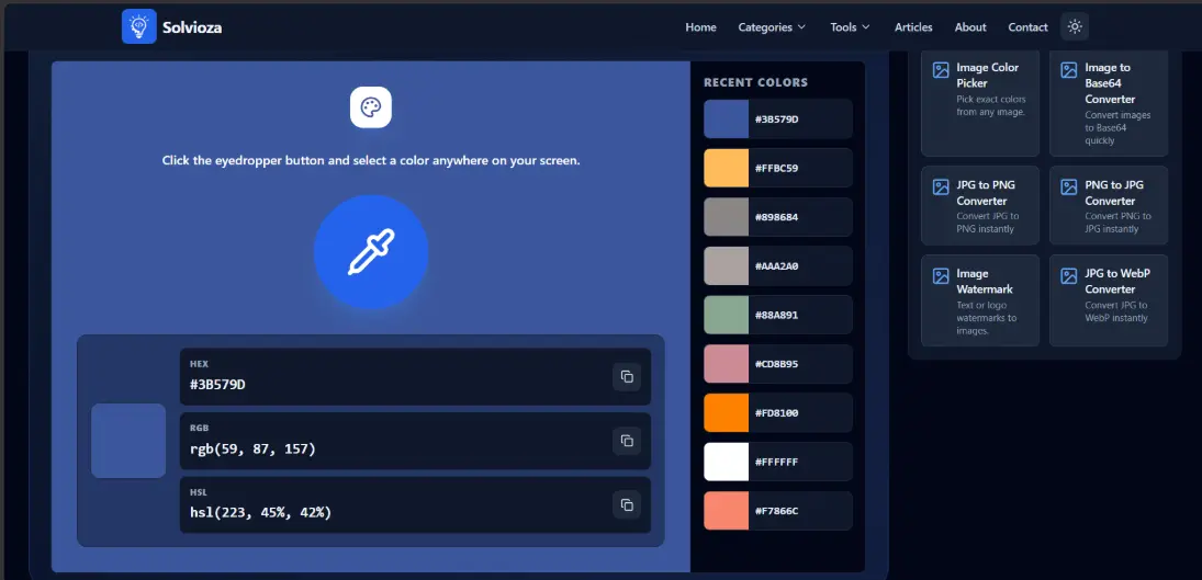
Recent colors are more useful than they look
At first glance, the recent colors area may feel like a small extra.
In practice, it turns the tool from a one-click utility into something more thoughtful.
Imagine you are sampling colors from a dashboard. You pick the main blue, then a soft neutral panel background, then a border color, then a green success state. Without a recent history, you would need to remember what you chose or copy every value immediately.
With recent colors, you can build a mini reference set as you go.
That helps when you want to compare:
- two similar background grays
- a default button color versus a hover state
- several accent tones from the same brand page
- multiple status colors from one interface
- a heading color against nearby body text
Those comparisons are often where the real value shows up.
When this tool is the wrong one to reach for
If you need colors from a saved image file, the Screen Color Picker is not the best tool. The Image Color Picker is.
Why?
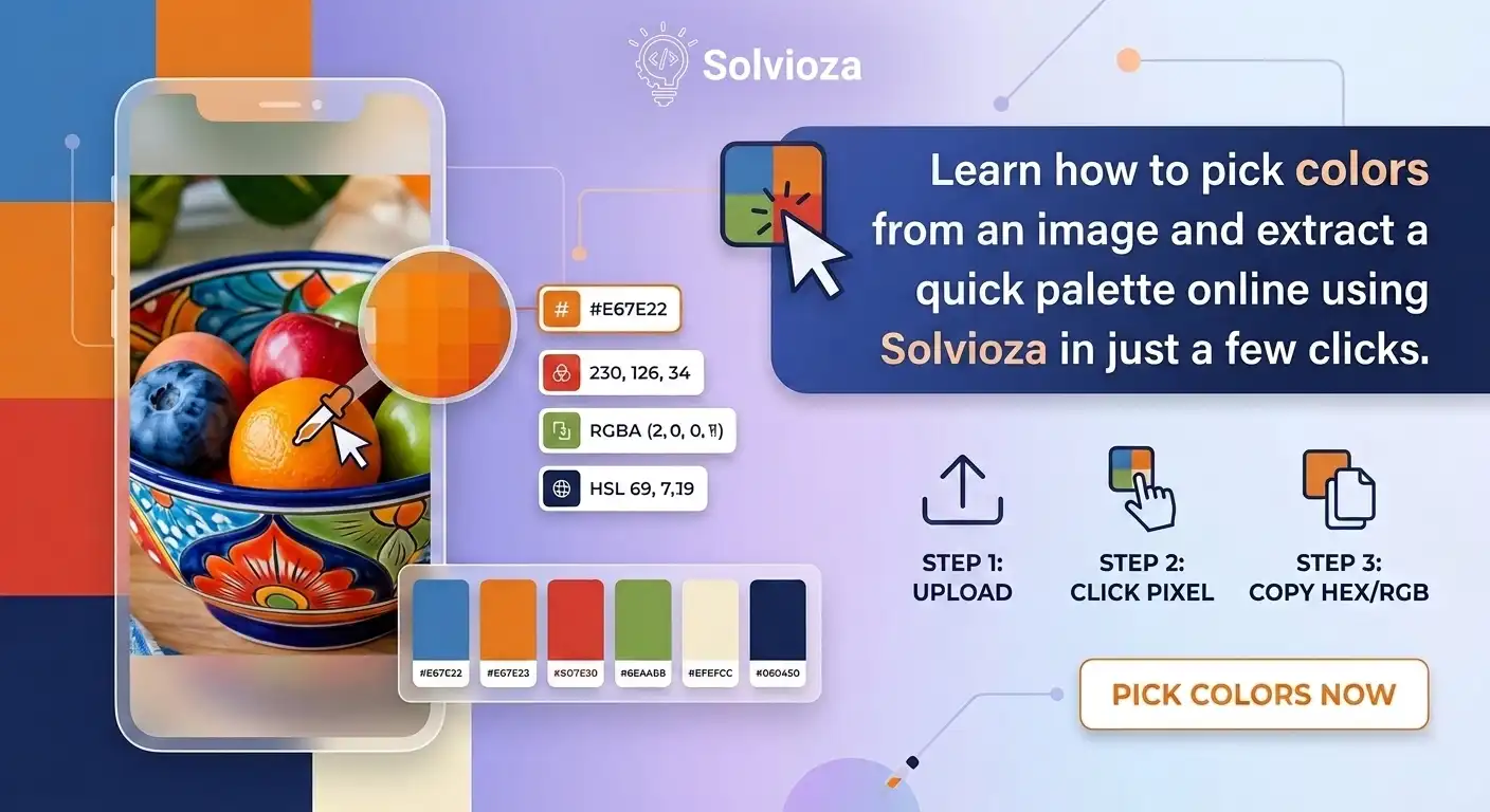
Because image-based work often needs a different flow. You may want to upload a file, click inside the exact photo, inspect neighboring pixels, and maybe extract a small palette of dominant colors. That is what Solvioza’s Image Color Picker is better at.
It is also better when you want to work from a prepared file that has been cleaned up first. For example, if the image contains too much noise or empty space, you may want to isolate the useful area with the Image Cropper or reduce oversized dimensions with the Image Resizer before extracting colors from it.
So the split is simple:
Use Screen Color Picker for live screen sampling.
Use Image Color Picker for uploaded file sampling and palette extraction.
That distinction keeps the workflow cleaner and makes the article more honest.
A few real-world use cases
This tool becomes much easier to appreciate when you think in situations rather than features.
Say you are rebuilding an older marketing page. You need the exact hero button color, but no one remembers the original design token. Screen Color Picker solves that immediately.
Say you are writing CSS for a UI component and want the same muted background tone used elsewhere in the product. Instead of approximating it, you sample it from the running interface.
Say you are auditing a website for consistency. You suspect that two cards use slightly different border colors even though they are supposed to match. Sampling both can confirm that quickly.
Say you are making branded social graphics and want to echo the exact accent color from the company website. Again, one click gives you the real value.
These are not dramatic tasks. They are just common moments where accuracy saves time.
A good habit: pick a small set, not just one color
If you are working from an interface, try not to leave with only one sampled color unless that is all you truly need.
Usually a screen contains a usable set:
- a primary accent
- a secondary accent
- a surface neutral
- a divider or border tone
- a text color
- maybe one status color
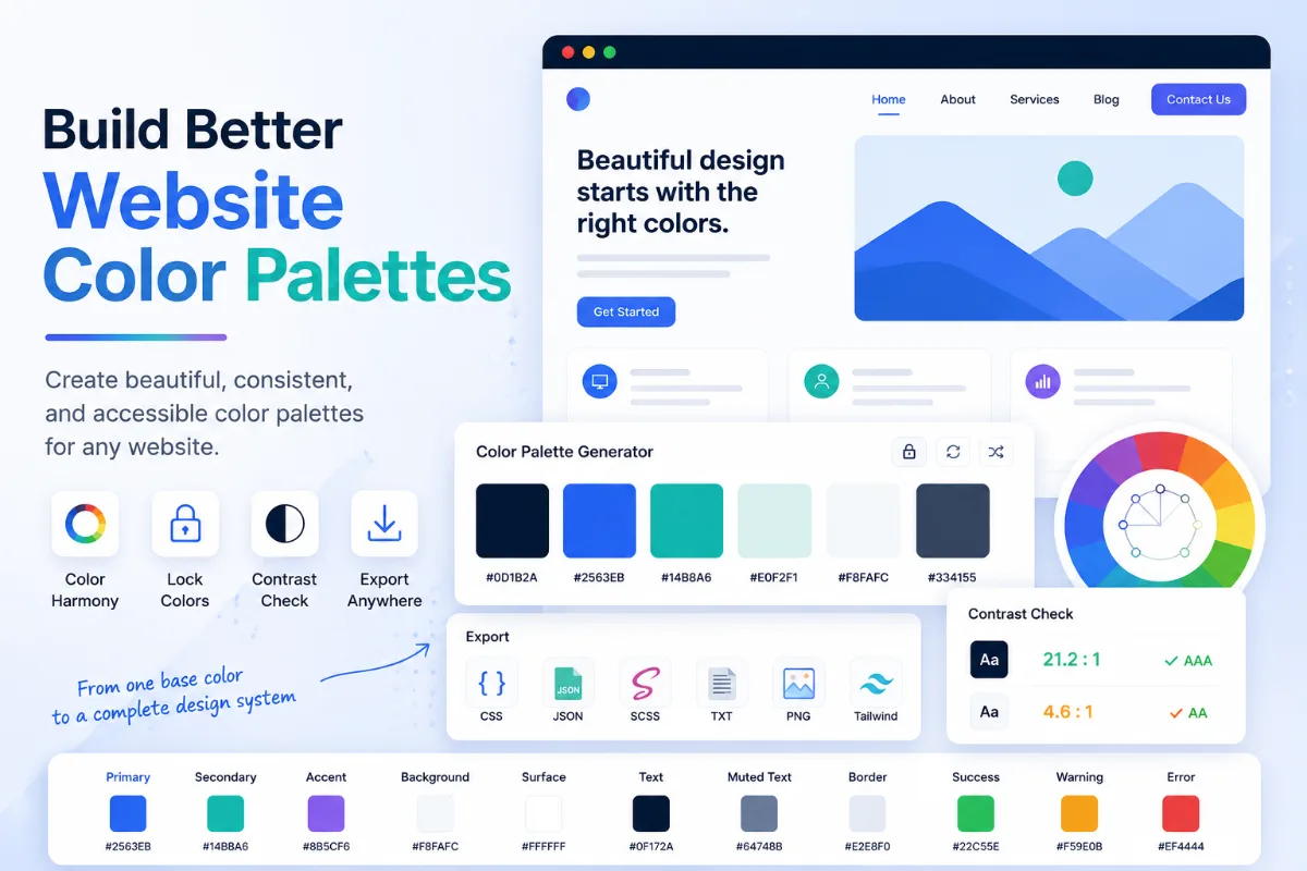
If you collect a handful of them, the recent-color list becomes a lightweight palette builder. Not a formal palette extractor, but a very useful working reference.
That makes the tool more valuable for design systems, audits, restyling work, and theme matching.
Where a screen picker can mislead you
This is worth saying because it saves frustration later.
A screen color picker samples what is displayed, not what was originally authored.
If a browser, overlay, transparency effect, or gradient changes the visible output, the picked value reflects that visible result. For most practical use cases, that is exactly what you want. But if someone expects to recover the source brand token used before layering effects, they should keep that difference in mind.
In other words, the tool captures the real visual color on screen, not necessarily the original untouched design value hidden upstream.
That is usually a strength. It just helps to understand what you are sampling.
A quick closing thought
Screen color picking is one of those small utilities that earns its place by being faster than the workaround.
If the color is already on your screen, Solvioza lets you grab it directly, copy it cleanly, and move on with real values instead of approximations. That keeps design work sharper, frontend work more consistent, and little visual decisions less annoying than they need to be.
And when the job changes from live screen sampling to image-based sampling, the Image Color Picker picks up exactly where this tool stops.